Let me tell you a little bit about the process of making this poster for
our concert next Sunday, November 10.

What do you see when you look at it? I wonder.
Dabbling in this new world of graphic design I’m always thinking about what’s the most important thing to have when I declare it finished. I figure it needs to attract people’s attention “hey, what’s this?” and it needs to identify the content of the concert so people can decide if they would want to attend, with a compelling image for the visual people as well as cleanly formatted wording for the readers.
I like to play the music before I start in on designing the poster. I like to get a visceral sense of the program and then get to work portraying those feelings with the imagery. In the first rehearsals Cynthia Woods, our conductor, runs us through the music so we can see all the notes and learn our tempos (tempi?) and such. Truth be told I was not loving this program as I played it for the first time, it felt uncomfortable to me, it didn’t flow how I like music to flow, the meters were different and unsettling as nice as the melodies were.
Then Cynthia explained that this piece that we were playing was written in a concentration camp during WWII, that only one of the composers and players survived the war bringing these scores with him, and that this concert was in support and supported by the Terezin Music Foundation. If you click over to their website you will immediately hear one of the pieces.
I had a hard time playing the rest of rehearsal without welling up. Cynthia went on to say that though the music was written under difficult circumstances there was still a lot of joy in it since music was what they loved and they could find comfort there when they played.
so, the poster.
what in the sam hill can I put on the poster?
I talked about it with a few people, explaining the context and purpose of what I was trying to do. A fella at work gave me the solution, he said that I needed to represent what the musicians in the camps wanted when they played this music. And this answer was easy… home. There can be little doubt that these people would have simply wanted “home”.
Over the past year I’ve been lucky enough to take a jumble of mixed media, painting, and drawing classes from different sources that I found from my classes and connections at the Squam Art Workshops. Alena Hennessy got me mixing paint, papers, and ink. Kerry Ann Lemon showed how to be comfortable drawing with straight black ink. And my cabinmate clued me in on a great series of art journalling videos from Teesha Moore, which also focused on the use of cut paper.
With all these new materials and papers I sat down to work. This is the first time I’ve done a poster from the position of making a separate piece of art and incorporating it onto the digital page, versus just building the poster entirely on my computer.
Here’s the first one I did (with some edits to try white inked notes after completing the second one). I had papers that looked explicitly like wallpaper and tried crafting a violin that in itself looked like home. And then I learned a new lesson: digital images of a colorful piece of art don’t always properly represent the real life image. The violin on this first version has a very bright yellow pattern on the paper, but with all the photo editing in the world I couldn’t get the image to show like it did in real life.

So I started in on a second version that used even brighter paper. The violin isn’t as accurate in proportion as the first one, but the colors and overall vibe of the image felt better to use. Also, the notation floating away in black ink below works better than the white notes above.

I have to say that I’m a bit uncomfortable showing these two untouched images since I don’t consider them “finished”, but I wanted to show the influence of why I took this route while giving credit to the teachers who showed me how to use all these materials: that it’s “ok” to mix this stuff up, there are no rules.
Looking at the images I see parts that I could have done better, it looks a little clunky to me, in my head what I wanted to do looked different from this. But, as you can see at the top, I’m ok with how the whole ensemble of information and visuals work together.
So I wonder if people get the sense of “home in music” when they look at this image. I do hope the poster brings people to fill the seats to listen to the work of these musicians. And I hope we at the CSO can do this music justice.
OK, I’m going to go practice now. – H
 The concert poster for the season premiere of the Cambridge Symphony Orchestra visually balances the light and dark of the musical program. I used the method I worked out from the April chamber concert poster playing with illustrator’s path settings. My intent is to use this theme for all the posters this year, changing the colors and mood depending on the pieces we play for each.


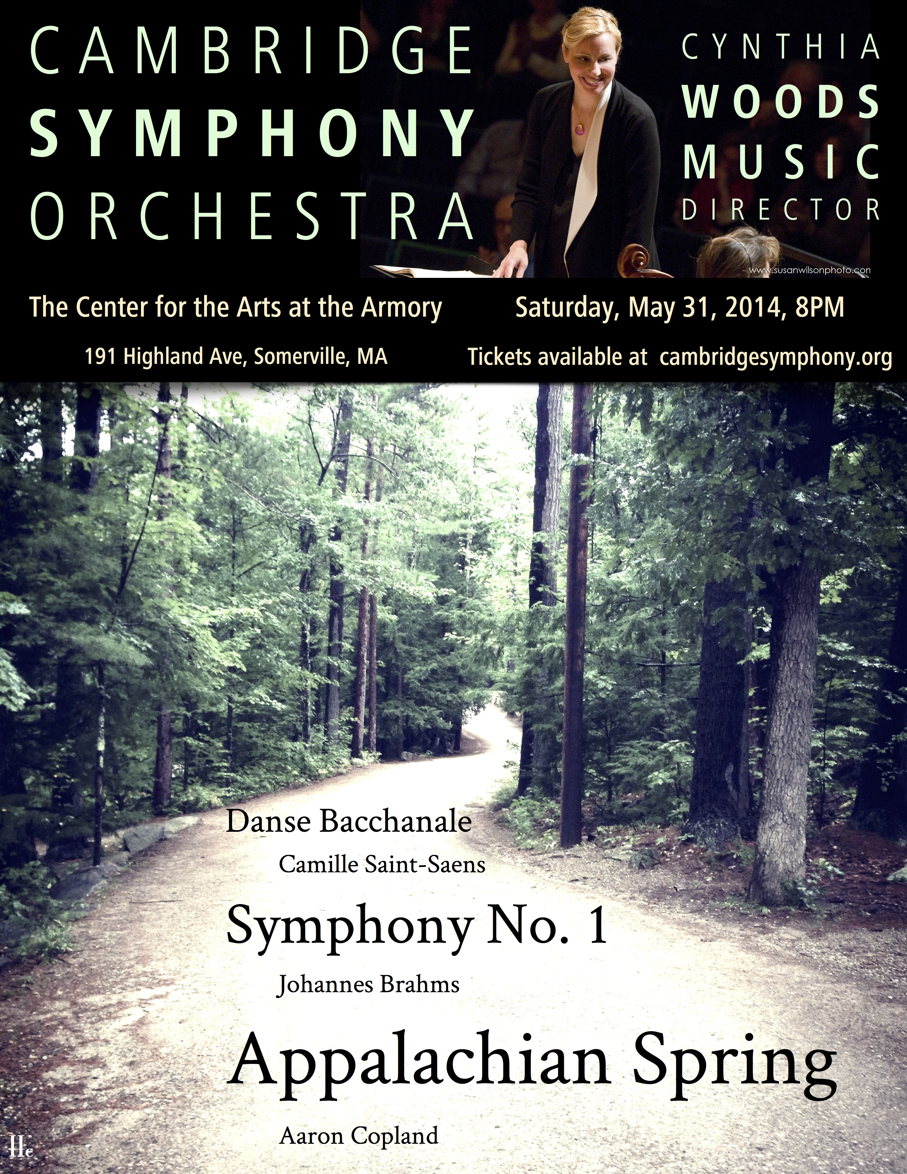 For the last masterworks concert of the 2013 – 2014 season the CSO is playing the lovely peaceful Appalachian Spring by Aaron Copeland.