In 2015, I decided to go in for purchasing Adobe Illustrator since I’d be using for both CSO posters and my knitting pattern diagrams. Like everything, it was an educational process since I’m the type to jump in and get a tool working, rather than take the time for a class.
I set up a workspace with “artboards” for the whole season. This way I can see, compare, and use elements across the group of posters and ads. And what goes on the first poster tends to set the theme for the season.

There are always head-shots of the musical guests, along with a lot of text and sponsor logos. I like to pick a color scheme for the text to draw attention to the soloist. In the case of the Mahler poster above Indra Thomas’s beautiful photo has a lovely green-grey backdrop that I wanted to work with. And as a new Illustrator user, playing with text appearance was the most fun, so I decided I had my theme for the season. All the posters would have roughly the same layout with the “Cambridge Symphony Orchestra” text working with the soloist head-shots.

Here for “Holiday Pops” I chose Adobe’s subtle sparkle effect for the CSO text along with an already festive head-shot of Jennifer Sgroe and a happy photo of Cynthia Woods.

The Family Concert in January always features are remarkably talented young musician, this year was no exception. Visually, I loved that Yoo Jin Ahn’s cute head-shot has a white background. The CSO text illustrator fun for this concert was the bright pastel colors from the Illustrator “graphic styles” library.

Doing this for a couple of years now, I have to say the March concert always throws me for a loop for the color scheme. If I use springtime green it makes people think of St Patrick’s Day which is almost never the concert theme, and especially since the program for this concert is “The Russian Masters” I had to work with something else. I went with a color theme in the red and blue spectrum since using the grey in the soloists head-shot would make the poster too dreary, giving the CSO text a circular blue gradient glow.

The Chamber players need a poster from time to time, and I could go off the season’s theme trying something new. I played with Illustrator paths to create a fun swirly violin, and I loved this effect so much it is going to be the theme of the 2016-2017 posters.

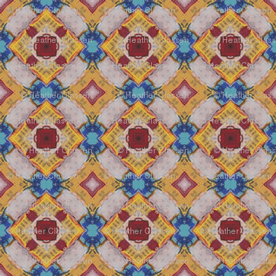
This Firebird show with the accompanying ballet ended the classical season with a bang. The concert was a labor of love for many, with the dancers and musicians using their creativity to bring this event to the next level. I contributed with the painting “The Prince and the Firebird” that I was able to work into this poster format. Having too much fun with color and design I created this surface design line at Spoonflower.

And finally, for the end of the season I had some more Illustrator fun, creating warped text for the title. The CSO logo is still recognizable with the SYMPHONY portion shown in bold. The entire image has an under layer of crumpled paper to portray a summer-of-love type vibe to it. I used color picker to pull the color from the sponsorship logo to use for the background and lettering.
Often the tools used and project restrictions dictate what the posters will look like. The limits, I find, help the creative process, if only to keep projects from being over-designed.
The one most important thing that I have learned in this post-tech artistic life: designing is decision making.


