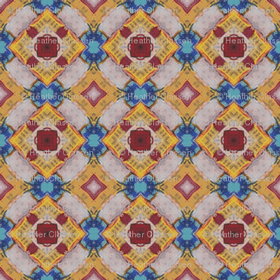
Visit Heather Classen’s fabric shop at Spoonflower.
Surface design work created from Heather’s painting can be used for fabric projects, wallpaper, and all that Spoonflower has to offer.

The Graphic Design Portfolio of Heather Classen

Visit Heather Classen’s fabric shop at Spoonflower.
Surface design work created from Heather’s painting can be used for fabric projects, wallpaper, and all that Spoonflower has to offer.

 Education is everything: learn, know, understand, so easy now with online learning. We live in a wonderful time where we can get classes about anything and everything online, and usually for free. Like with exercise – challenging yourself mentally keeps your brain bright and active throughout your life.
“no pain no gain”
I plan to keep a list of the online classes that I’ve taken and recommend here in this post, as well as the classes I am currently taking. The classes are at different levels, different colleges, different websites, etc.
Helpful for indy designers and crafters:
Bookkeeping for Crafters with Lauren Venell • A pragmatic guided tour through business accounting for people setting out on their own craft business for $79. There are a lot of good classes over at Creativelive.com, many of which they run for free if you catch them streaming on their “onair” page.
For Knitters:
Lace Shawl Design • This class by Miriam Felton gave me traction when it came to creating my very first design, the Hoo*Bert Shawl.
Graphic design basics:
Adobe Illustrator: Mastering the Fundamentals • There are always new techniques and tricks, this free class at udemy.com is worth the two hours of time to absorb illustrator basics.
In my queue right now:
Become a Game Developer/Designer : Complete Master Series • Getting my feet wet in game development and this one looks worth the time. This is another udemy offering, $10 at the time I signed up with a New Year’s deal good til January 10, 2017. $200 normally.
Game Theory • Free without a certificate at coursera.com, taught by professors at Stanford University and The University of British Columbia. A topic always intriguing to me, but I’ve never spent the time to wrap my head around it.
Game Design: Art and Concepts Specialization • A series of reasonably priced classes in game design at coursera.com from CalArts.
Learn drums • I know I said education is everything, I lied. Education and music is everything. Figuring this one will challenge my musical abilities in ways I hadn’t imagined.
NOTE: Coursera, Edx, and Udemy all have apps so you can keep up with your classes on the go.
Wait a minute, hold up… I almost forgot to list
PODCASTS to feed your brain.
C-SPAN History lecture videos • Learn about history so we don’t repeat it.
Livestreams
Observatory Nights at the The Harvard-Smithsonian Center for Astrophysics (CfA) • I attend in person usually, but they have them all at Youtube. The best in astronomy information. Here is their Night Sky Report.
Let me know what you take, how you like the classes. And please help me encourage people to catch the online learning bug.
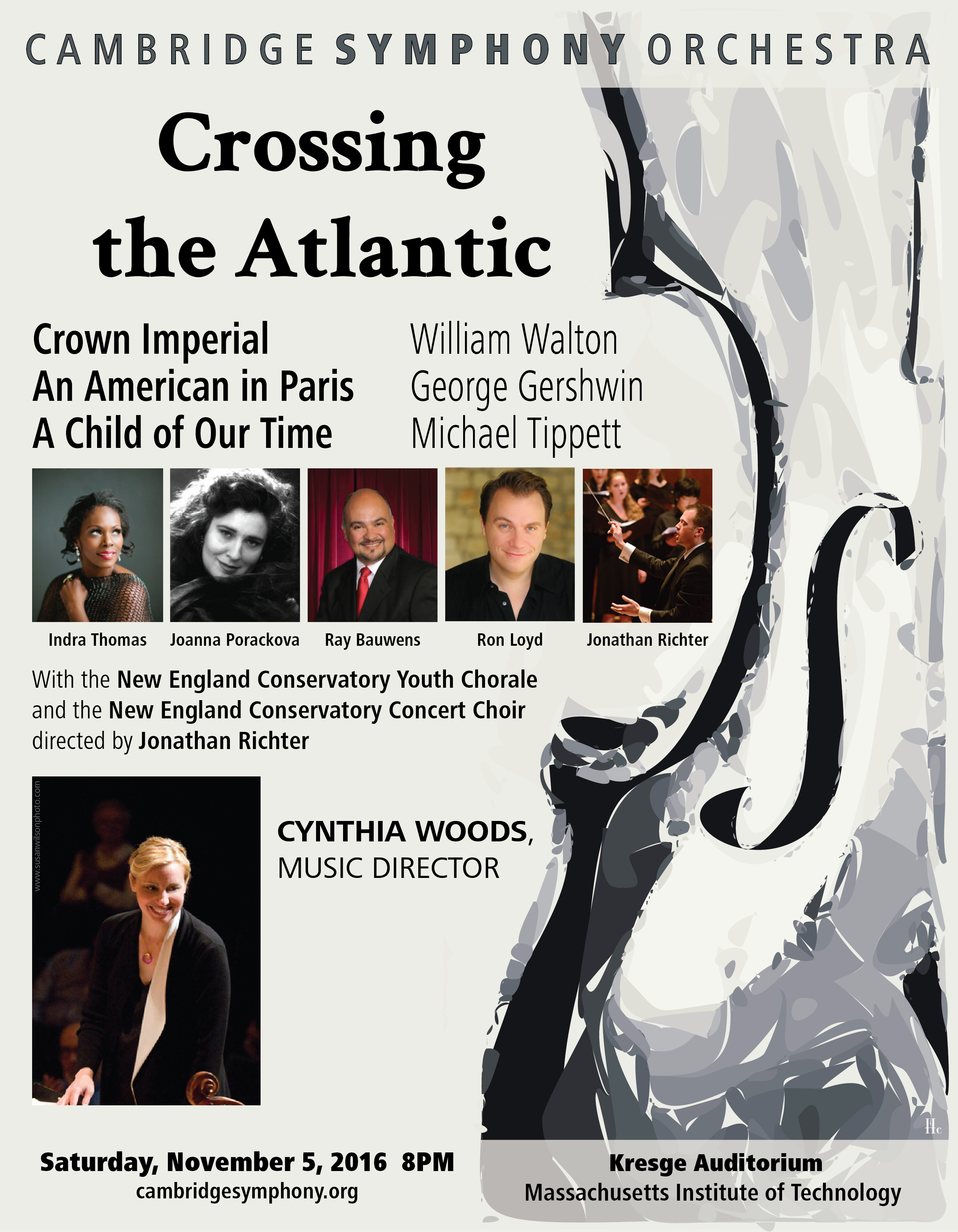 The concert poster for the season premiere of the Cambridge Symphony Orchestra visually balances the light and dark of the musical program. I used the method I worked out from the April chamber concert poster playing with illustrator’s path settings. My intent is to use this theme for all the posters this year, changing the colors and mood depending on the pieces we play for each.
Join us Saturday, November 5, 2016 at Kresge Auditorium at MIT.
I set up a workspace with “artboards” for the whole season. This way I can see, compare, and use elements across the group of posters and ads. And what goes on the first poster tends to set the theme for the season.
There are always head-shots of the musical guests, along with a lot of text and sponsor logos. I like to pick a color scheme for the text to draw attention to the soloist. In the case of the Mahler poster above Indra Thomas’s beautiful photo has a lovely green-grey backdrop that I wanted to work with. And as a new Illustrator user, playing with text appearance was the most fun, so I decided I had my theme for the season. All the posters would have roughly the same layout with the “Cambridge Symphony Orchestra” text working with the soloist head-shots.
Here for “Holiday Pops” I chose Adobe’s subtle sparkle effect for the CSO text along with an already festive head-shot of Jennifer Sgroe and a happy photo of Cynthia Woods.
The Family Concert in January always features are remarkably talented young musician, this year was no exception. Visually, I loved that Yoo Jin Ahn’s cute head-shot has a white background. The CSO text illustrator fun for this concert was the bright pastel colors from the Illustrator “graphic styles” library.
Doing this for a couple of years now, I have to say the March concert always throws me for a loop for the color scheme. If I use springtime green it makes people think of St Patrick’s Day which is almost never the concert theme, and especially since the program for this concert is “The Russian Masters” I had to work with something else. I went with a color theme in the red and blue spectrum since using the grey in the soloists head-shot would make the poster too dreary, giving the CSO text a circular blue gradient glow.
The Chamber players need a poster from time to time, and I could go off the season’s theme trying something new. I played with Illustrator paths to create a fun swirly violin, and I loved this effect so much it is going to be the theme of the 2016-2017 posters.
This Firebird show with the accompanying ballet ended the classical season with a bang. The concert was a labor of love for many, with the dancers and musicians using their creativity to bring this event to the next level. I contributed with the painting “The Prince and the Firebird” that I was able to work into this poster format. Having too much fun with color and design I created this surface design line at Spoonflower.
And finally, for the end of the season I had some more Illustrator fun, creating warped text for the title. The CSO logo is still recognizable with the SYMPHONY portion shown in bold. The entire image has an under layer of crumpled paper to portray a summer-of-love type vibe to it. I used color picker to pull the color from the sponsorship logo to use for the background and lettering.
Often the tools used and project restrictions dictate what the posters will look like. The limits, I find, help the creative process, if only to keep projects from being over-designed.
The one most important thing that I have learned in this post-tech artistic life: designing is decision making.
 “Hello World” is a short hand term for projects techies create while working on a new platform. My new platform? Spoonflower.
The “Hello World” idea is similar to the Minimum Viable Product, “MVP“, for people that know something about marketing, where the learning process involved in getting the first item/program/project/design out into the world takes most of the work. Theory being that once you get this first one done, the rest will follow much easier. I mean, think of all the learning involved with any new thing you’ve tried to do. Procrastination can get the best of you, but giving yourself the one goal to push toward, the “Hello World”, the first product, the first class, etc, you have something achievable and worthwhile.
I started by drawing up a design in Adobe Illustrator.
Getting the repeat right is the crux of the design process. A lot of good information is available on surface design repeats on YouTube.
Once I had my MVP design ready to go I uploaded it, ordered my proof, and waited by my mailbox.
When it arrived I opened up the package and inspected my new fabric, and oh no, a subtle problem: there was a light “aliased” outline on the right and bottom edges of the repeat. It may have been mistaken for wayward white thread if I had left it as it was, but it would bother me not to fix it.
Spoonflower support was very helpful, told me I could edit my file to remove the white outline, re-upload, and release it for publication.
A little Pixelmator, and boom, done.

So now I’m literally in business.

Please leave a comment if you have any experience with Spoonflower, either sewing or designing with it. And please watch this space for more upcoming designs.
Nerd On,
Heather
6 posters. Big season made tiny to fit in this space.
Photos by Susan Wilson and Aram Comjean
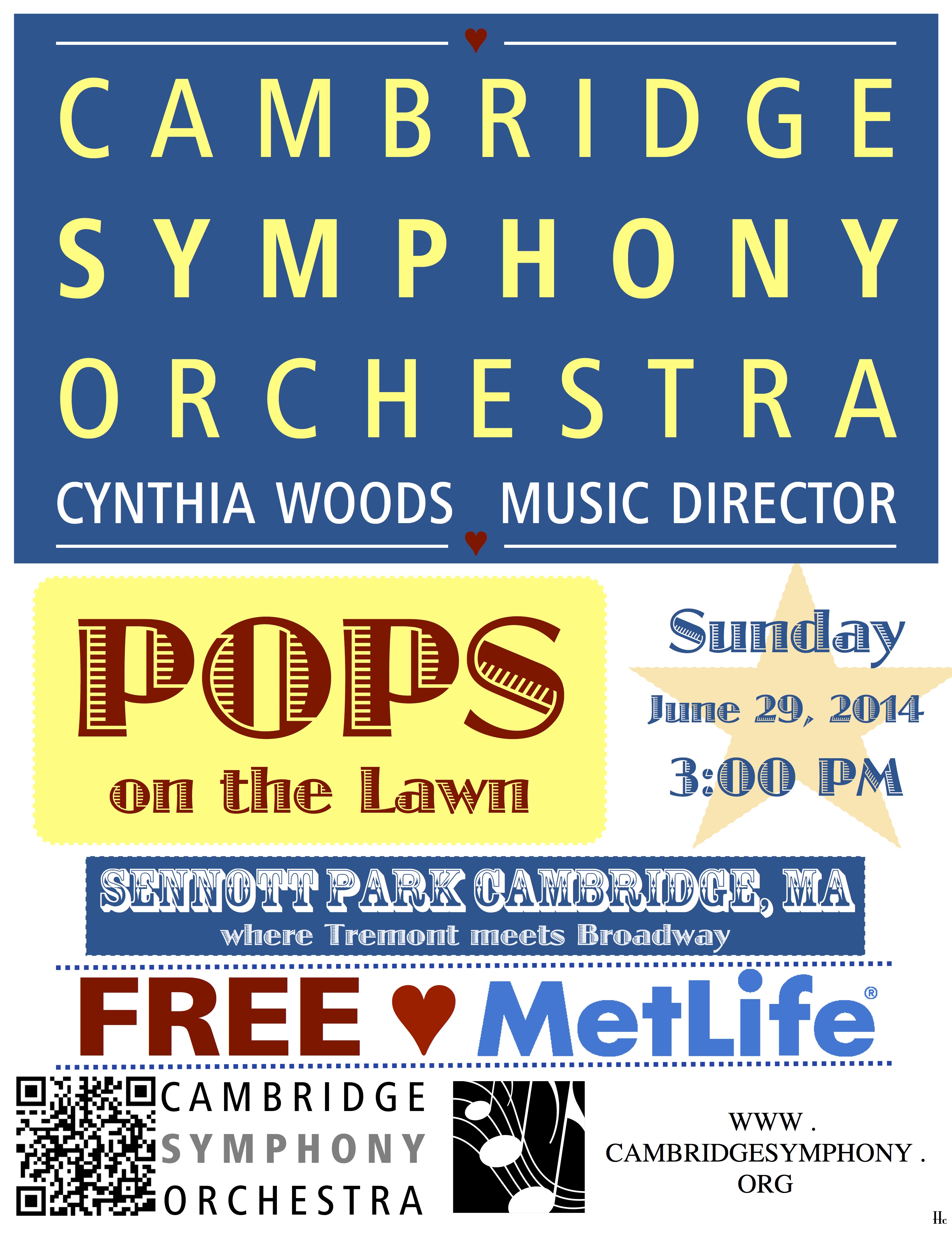 A respin of last year.
Bring the kids, they get to conduct.

At Sennot Park in Cambridge.
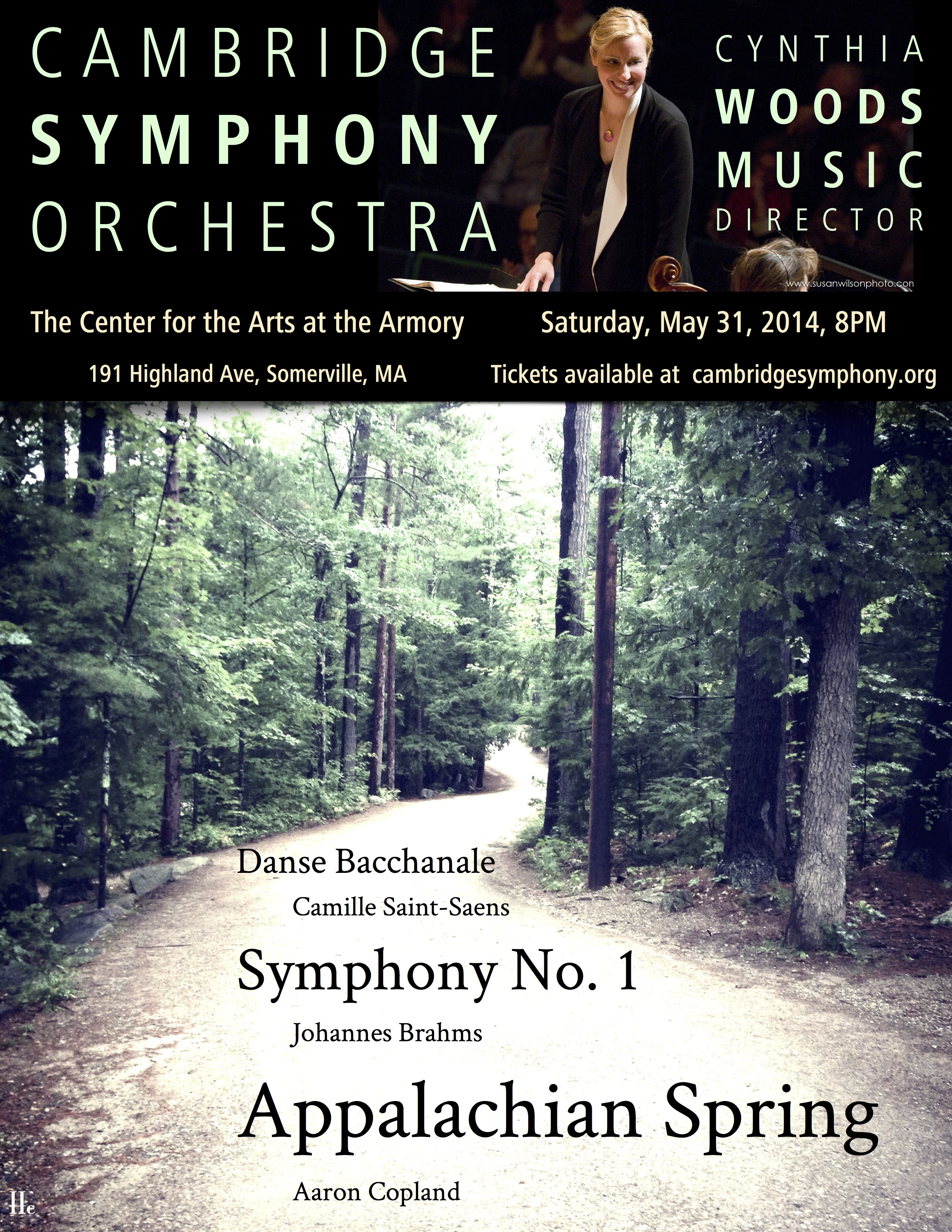 For the last masterworks concert of the 2013 – 2014 season the CSO is playing the lovely peaceful Appalachian Spring by Aaron Copeland.
Mountains. Forest. Quiet.
Maybe I have a photo that would suffice. Like something I took at Rockywold Deephaven Camps while attending the Squam Art Workshops.
Yep, it was just like that. Peaceful.
This mini one for the newspaper.
 Opera
Opera
I didn’t think I would like it, but I’d give it a try once.
So back in the late 1900s I saw there was a performance of The Marriage of Figaro performed by marionettes. Thinking, ‘yeah, I like marionettes, I’ll give marionette opera a try. There’s subtitles, it’ll be fine’.
Imagine, if you will, wooden people bouncing around on strings singing “Figaro, Fig-a-ro, FIG-aroooooo”, with their only emotional expression coming from how high or low their skinny arms are pulled.
“La,” wooden hand up, “lalalalalala“, wooden hand down, “LA“, wooden hand waving in flourish, “laaaaaaaaa“.
Bad.
Since my Italian grandfather loved opera and his sister sang opera, I wanted to give it a fair chance. Fortunately, I caught a modern adaptation of Don Giovanni with subtitles on PBS and LOVED it. Later on I even saw a live production of Cosi Fan Tutti in Boston with real human beings in it and enjoyed that as well, if only cuz of it’s “Three’s Company” farcical style plot.
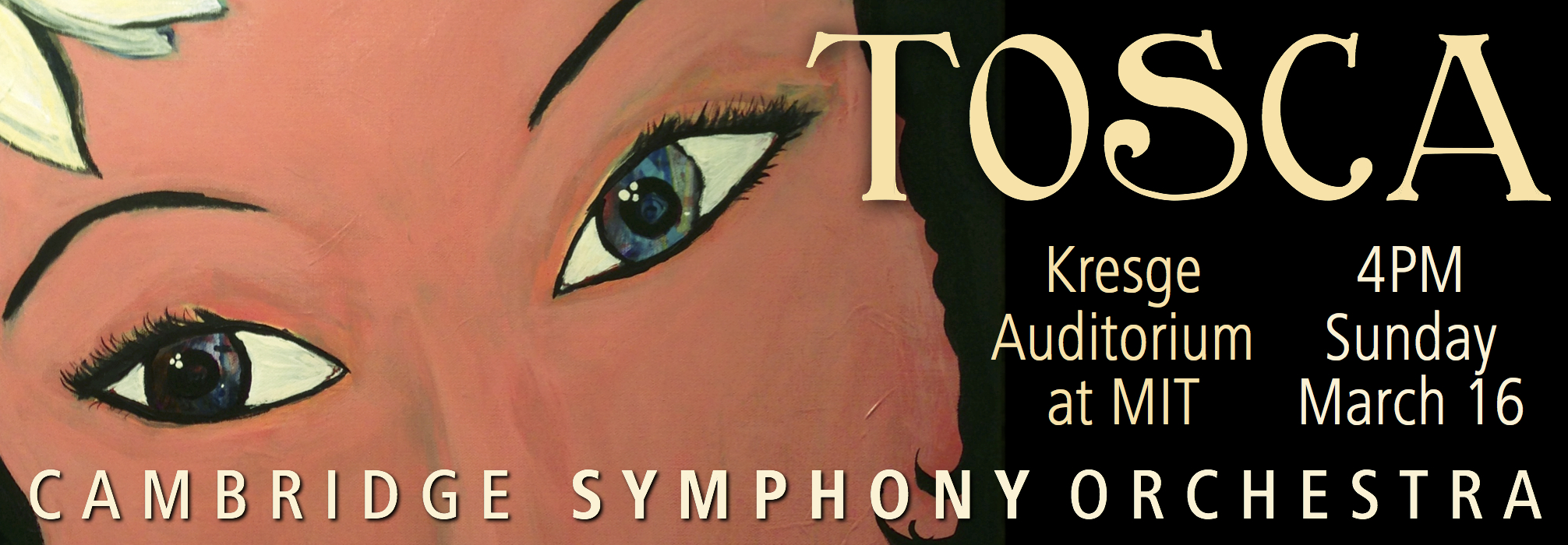
I wish my grandfather and his sister were around to see our Cambridge Symphony Orchestra production of Tosca on Sunday March 16.
So, the poster… what the heck do I do?
I was stumped at the enormity of the task as I knew how excited everyone is to get this right. I was frozen trying to come up with imagery that will dignify the event.
I started with doodles in my engineering notebook during a meeting.
I doodled up a dagger with a hilt that looked like a violin sound hole. Thought, hey cool, and was on my way. I spent the weekend in my art space in my basement with India inks, acrylic paint, tissue paper, and cut paper. Spent some time figuring out how to draw an art nouveau font, and came up with this.
And then, thinking the concert will be in springtime I decided to make the red pop by putting it on an aqua background.
All the while I’m working on the clever dagger idea this is sitting on the easel behind me.
In 2012 I’d taken Flora Bowley’s ecourse to get back into painting, which I hadn’t done at any length since I was a teenager. Her approach has you just painting a bunch of gobbledy-gook with fluid acrylics, honing and fixing, until you work it up into something truly unique… as you had no idea what you were going to paint when you started. She wants you to have messy underpaintings.
This is the underpainting for what became the final Tosca poster.
Embarrassing, a bit, to show it here, but I wanted to show that I was going for an angry red busy unsettling vibe when I painted it.
Then, in the ecourse, Flora suggests going big and bold, draw a big image, make a big change, be unexpected. I painted a big face over the angry red background, I wanted a pretty face, but where you could still see the messy disturbed underpainting in the eyes.
And there she sat for months, in my basement, I didn’t know where to take it.
With this painting behind me and the cheery dagger painting in front of me I rented a Tosca DVD and figured I’d let the story percolate so I would have a better clue of how to make this right.
Here’s the TL;DR of Tosca: Tosca has a painter boyfriend, she’s jealous, she’s pretty, creepy guys are into her, and she would kill a man if she had to.
And her name is Floria. Floria, come stai?
Now I knew what to do with the painting.
Come to the concert… find out what happens to her.
Not a lot of insight into the design of this one.
It’s about baseball, I went literal.
Thanks to Aram for the feedback, as always.